Business Made Simple's StoryBrand website is a great example of how to write a winning registration page for your event.
Address FAQs, clarify the value of your event, and incentivize attendees to act now to maximize registrations once participants reach your landing page.
People register for business events for all sorts of reasons.
Some need to refresh their skills. Others are just looking to make new contacts. Whatever the reason, most people who sign up for an event want to know one thing.
How will this experience help me grow in my career?
I recently signed up for Business Made Simple's StoryBrand conference and was impressed that the landing page did a good job answering this question. Here's how.
Address what every potential attendee is asking first.
Right now, business travel is off the table. We are in the midst of a pandemic and being in-person with a group of other people from around the world is irresponsible.
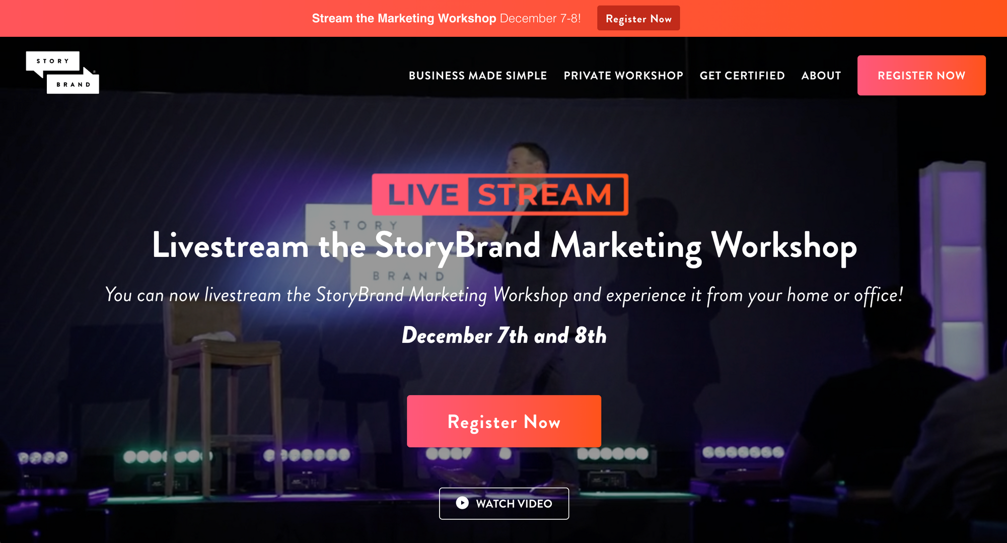
StoryBrand's landing page addresses this upfront. It makes it very clear that this is a virtual event that will be livestreamed.
It also has a secondary button under the registration button that links to a video telling me exactly what to expect from the workshop. Business Made Simple's CEO, Donald Miller, shows me the resources we'll be using during the workshop, what I can expect to learn, and a little more about the format of the event.
Clarify why this experience isn't a waste of time.
I've been in so many virtual events, webinars, and video meetings in the past few months, I'm frankly sick of them. To spend money to participate on another video chat doesn't seem appealing.
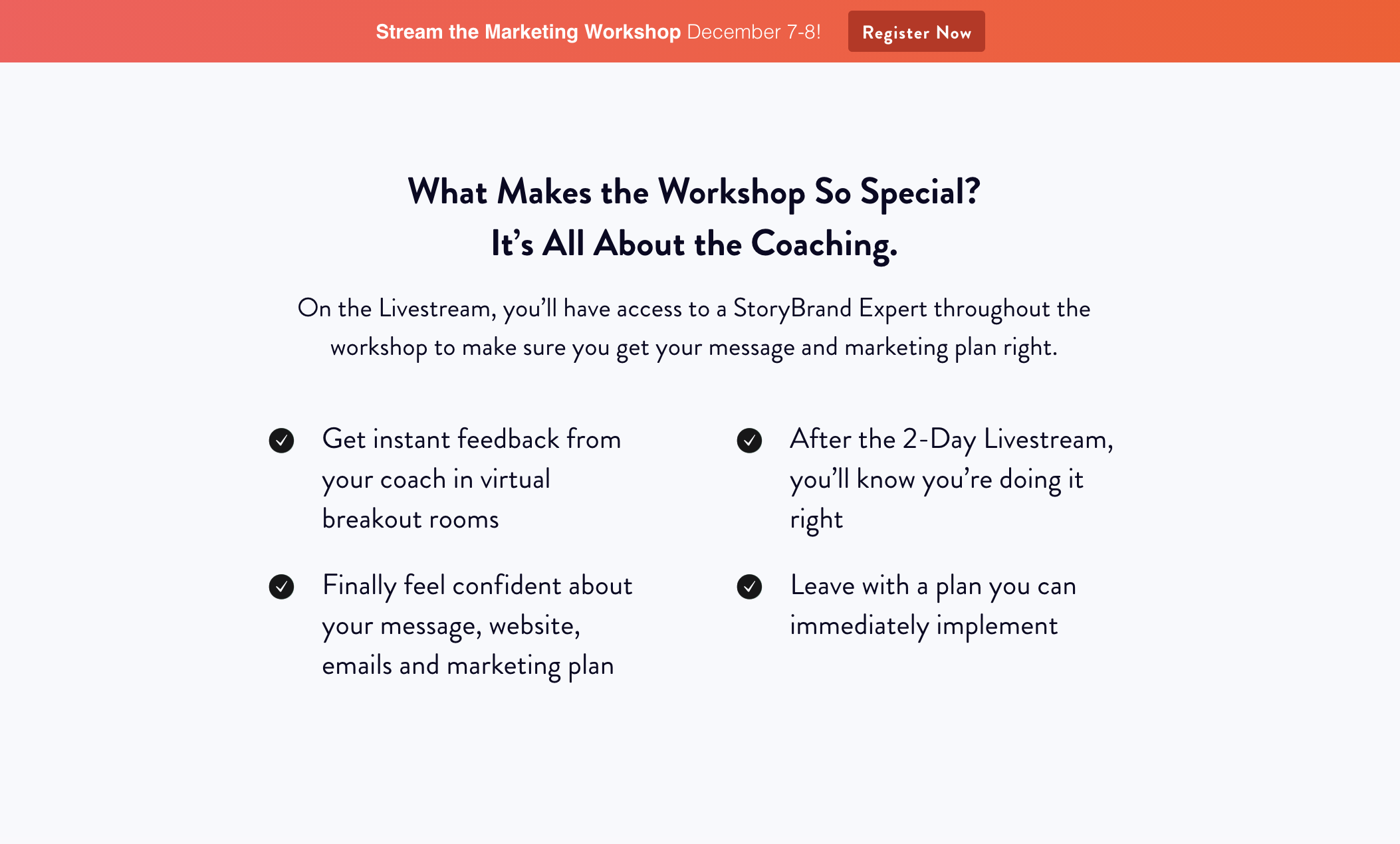
But StoryBrand isn't another video chat. It's not some passive or unproductive experience. It's a workshop. More than that, you'll be in a small group chat with a coach.
This is going to be an inspiring and collaborative experience that leaves you with action items that will help you take your business and professional skills to the next level. Now that's something I can get behind.
Incentivize potential attendees to act now.
Discounting is an awful marketing tactic. Retailers do it when their merchandise goes out of style but they still need to move it to make up losses and make room for next season's products.
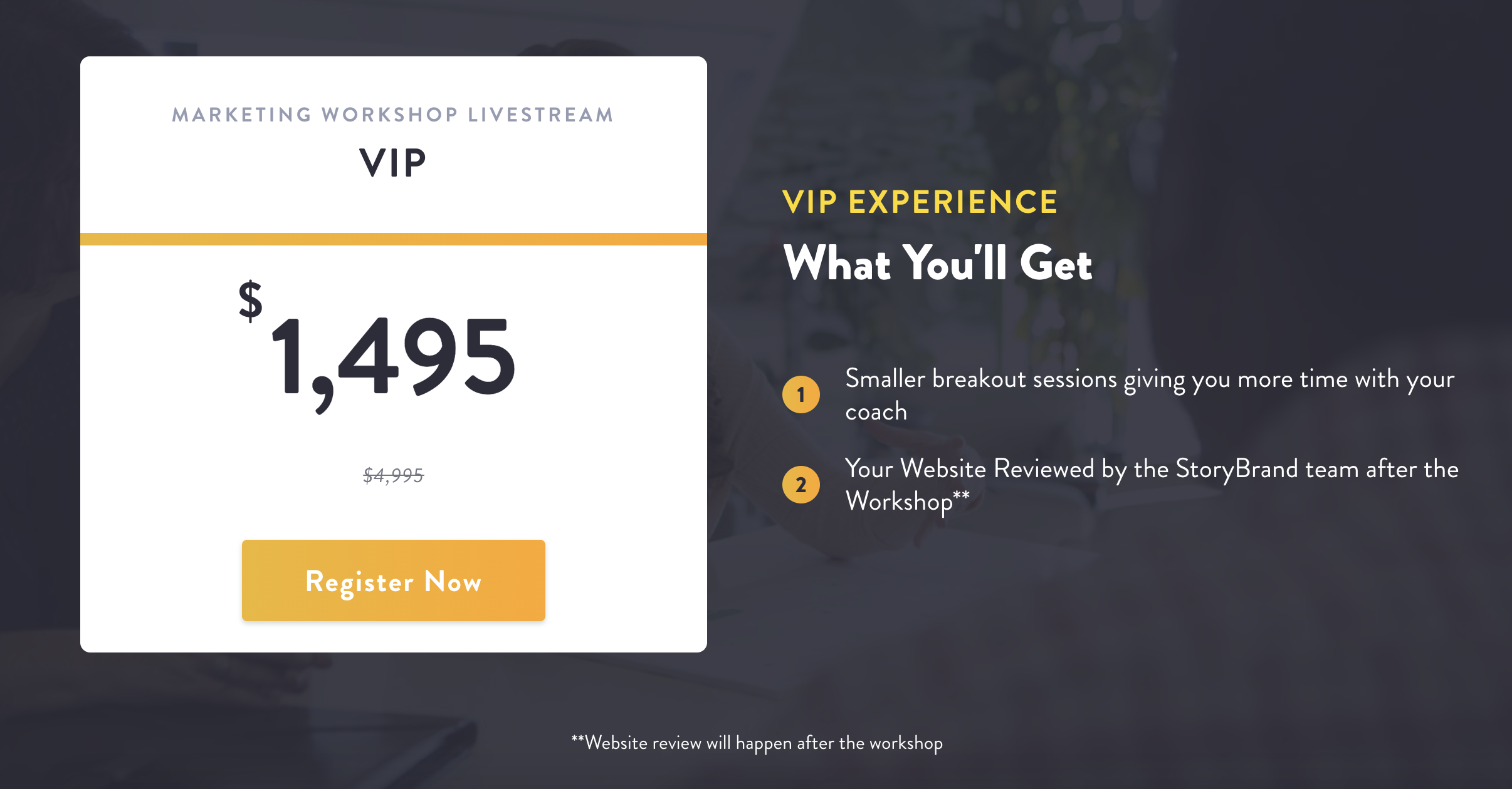
The problem is when you have a premium product that you put on sale, customers perceive the full price as a rip off.
Early-bird pricing, however, is a bit different. StoryBrand values the full experience at nearly $5K. Those who sign up early get it for less than $1500. It positions this lesser price as a value for those who act early.
Resolve any last minute hangups.
StoryBrand resolves any lingering doubt through three means:
- Providing social proof
- Setting expectations
- Answering FAQs
Throughout the single landing page, they share testimonials, remind registrants of the resources this experience will provide, and answer questions they often receive. They end with a simple registration form that makes it easy to sign up.
Writing a landing page for your event doesn't have to be difficult.
Follow this example to write a winning landing page for your event. If you're still struggling, you know where to find me.
— Mike Doane
P.S. Don't walk away empty-handed
Above the Fold is a newsletter about the power of marketing. Every week I send stories just like these straight to your inbox.
